WHY ISN’T MY WEBSITE CONVERTING?
Picture this, you’ve invested blood, sweat and tears into creating your new website and you hit that metaphorically ‘big red button’ to launch it into the public eye to…crickets. Nothing happened. Nada…silence. Sound familiar? We’ve heard this time and time again from small business owners who find that after the big launch their website simply isn’t working hard enough for them and so we’ve complied some tips to commercialise your website and hit those goals with a bit more ease.
Need help with website design?
Have a Clear ‘Call to Action’
Have a Clear Call-to-Action (CTA) Your website should have a clear and prominent CTA that tells your users what action they should take next, preferably in the form of a button. Whether it's to sign up for a newsletter, fill out a form, or make a purchase, the CTA should be easy to find and stand out from the rest of the content on the page. We recommend that this is immediately clear on your landing page so that potential customers or clients won’t miss it when scrolling!
2. Optimise for Mobile
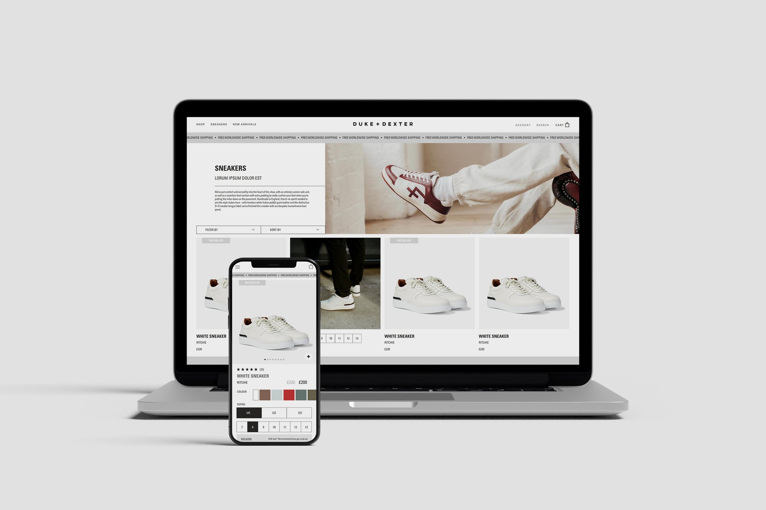
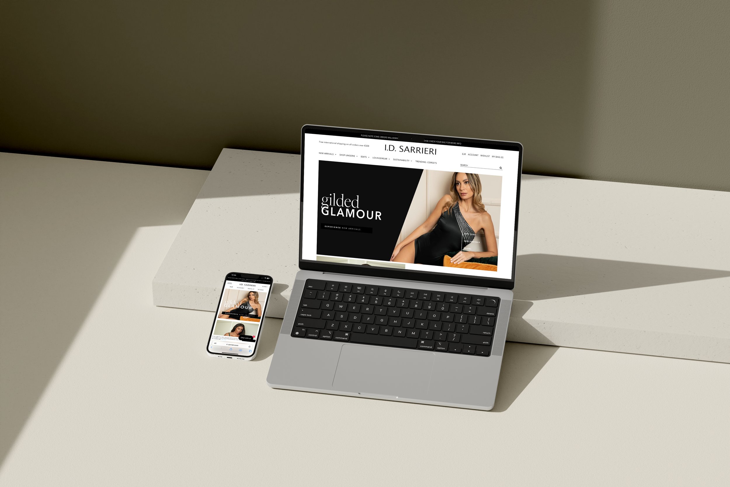
In today's mobile-first world, it's crucial that your website is optimised for mobile devices. A responsive design that adjusts to different screen sizes and resolutions will ensure that users have a seamless experience no matter what device they're using. As of February 2023, 52.08% of the total web visits are currently mobile, compared to 47.92% coming from desktops, so having websites designed for both is crucial!
3. Use High-Quality Images and Videos
Visual content is a powerful tool when it comes to making your website convert. High-quality images and videos can capture users' attention and help them better understand your product or service. Be sure they tell the right story and support your brand values. However, make sure that your visuals are relevant to your brand and are not distracting or overwhelming. They also need to be resized and optimised to ensure the content loads well for visitors, you don’t want people visiting and getting frustrated because nothing will load!
4. Improve Page Load Speed
This takes us onto the next point of improving your page load speed. As we mentioned above, slow page load speeds can frustrate users and cause them to abandon your website. Use tools like Google PageSpeed Insights to test your website's speed and identify areas for improvement. Some common fixes will include optimising images, minimising code, and reducing the number of HTTP requests.
5. Make Navigation Easy
Users should be able to easily navigate your website and find what they're looking for. Use a clear and intuitive navigation menu and make sure that all links work properly. Additionally, consider using breadcrumbs or a search bar to help users find specific content. This should also be consistent throughout your website keeping in line with your branding.
6. Provide Social Proof
Social proof, such as customer reviews or testimonials, can help build trust and credibility with potential customers. Incorporate social proof throughout your website, such as on your homepage, product pages, and checkout page. We all love a review, according to a 2021 report by PowerReviews, over 99.9% of customers read reviews when they shop online. So it’s really important to have these center-stage and to also encourage previous clients to review!
6. Offer a Clear Value Proposition
Your website should clearly communicate the value that your product or service offers to users. Use concise and compelling language to explain how your product or service can solve a problem or meet a need. Your brand has it’s own tone of voice, make sure you keep to this, it encompasses the style, language, and personality of the brand and is an essential part of a brand's identity. And make it snappy - the average user spends seconds on each web page, looking for the content they need so if its not easy to find, you’ve lost a potential client.
Making your website convert requires a combination of user-friendly design, clear messaging, and strategic elements that drive users to take action. By implementing these tips, you'll be on your way to a website that not only looks great but also drives results. If you need any more help or are looking to get a website designed, then get in touch! We would love to hear from you and bring your dreams to life!


