Designing for Trust: How Consistency Builds Customer Confidence
In branding, consistency isn’t just a “nice-to-have”, it’s what makes people believe in you. It builds confidence, reinforces recognition, and creates that oh-so-satisfying moment when a customer says, “I love your brand – it’s just so you.”
But consistency doesn’t mean everything has to be identical. It means everything has to feel like it’s coming from the same voice, the same place, the same energy. Like when your favourite singer drops a new track – it’s fresh, but it still sounds like them.
Here’s how to keep your brand visuals consistent (and powerful) without being boring.
Got a project in mind and want to get in touch?

1. Audit Your Existing Brand Assets
Let’s start with a little visual housekeeping. Look across your brand touch points – website, socials, email templates, business cards, packaging, all of it.
Ask yourself:
- Do my colours, fonts, and imagery feel cohesive?
- Is my logo used consistently?
- Does everything feel like it’s from the same brand world?
If not, it might be time to update your templates, refine your brand kit, or unify the tone of voice in your copy.
Small inconsistencies = big confusion.

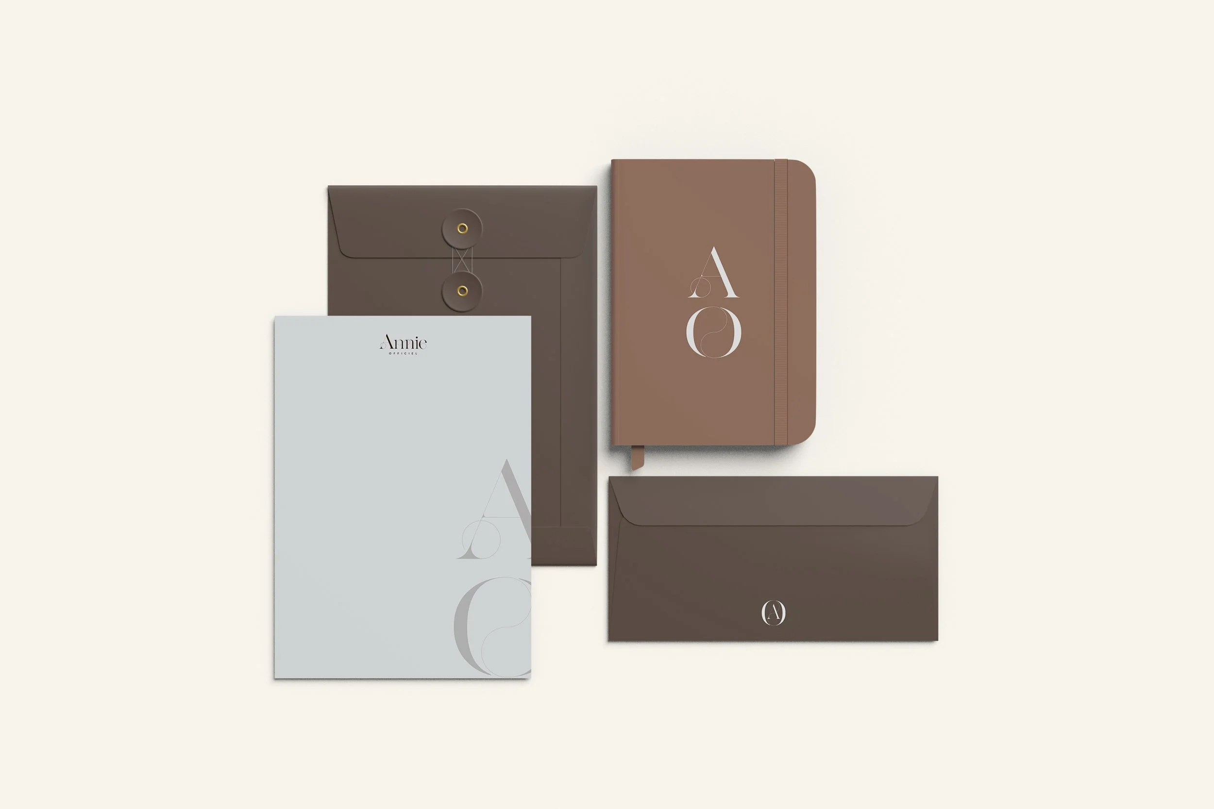
2. Create (or Revisit) Your Brand Guidelines
Your brand guidelines are like your visual bible. They keep you (and any collaborators) on the same page and stop design chaos before it starts.
At a minimum, your guidelines should include:
- Logo usage rules
- Colour palette with hex/RGB codes
- Font choices and hierarchy
- Photography style and mood
- Iconography and patterns
- Tone of voice (yes, even in visuals – your captions count!)
And no, this doesn’t have to be a 98-page PDF. A 2-pager that keeps your brand tight and tidy? Beautiful.

3. Design with Repeatability in Mind
Instead of starting from scratch every time, create reusable templates:
- Instagram post layouts
- Story highlight covers
- Email headers
- Product or service launch assets
Your future self (and your designer) will thank you. Plus, repeatable design builds visual recognition – which is great for conversions and even better for building brand equity.

4. Apply the “Three-Touch Rule”
Ever heard of the marketing “rule of seven”? People need multiple exposures before they remember or trust a brand. We’re big fans of the “three-touch” version for visuals.
Make sure your audience sees your brand’s visual identity in at least three places:
- On your website
- On your socials
- In your packaging or email newsletter
The more touch points that look and sound like you, the more your audience will trust what you’re selling.

5. Consistency ≠ Boring
Let’s bust a myth: consistent does not mean repetitive or dull.
Consistency just means your content is recognisably yours.
You can (and should!) still play with new layouts, campaign ideas, and seasonal shifts – as long as it fits within your brand's world.
Think of it like fashion – you’ve got a signature style, but you’re allowed to accessorise, right?
Trust Is the Ultimate Conversion Tool
In a noisy, visually overwhelming world, your audience is looking for brands that feel clear, confident, and dependable. When your visuals are consistent, your messaging is clear, and your vibe is unmistakably you – that’s when customers lean in and stick around.
So, if your brand’s been giving “identity crisis” vibes lately, now’s the time to clean things up. You don’t need a rebrand. Just a refresh, some guidance, and a plan.
Need help pulling it all together? That’s where we come in.
👉 Book a discovery call or browse our branding services to get started.