3 things to include in your email design
While the exact number varies from user to user, it is said that the average person receives over 100 emails per day, even without including spam. That’s a lot of emails! This number is only expected to be increased in the coming years since online communication is getting more and more adopted in everyday life. And with all those emails, the open rate is only between 20-40%, so how do we ensure our emails stand out from the rest, prompting them being read? {source: earthweb.com}
Need help with email design? We got you!

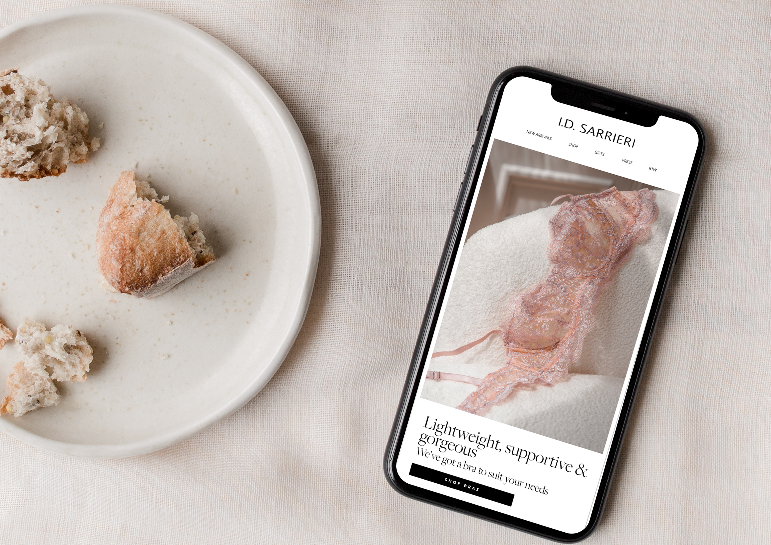
Here are 3 things to include in your email design which will help attract attention…
OPENING WITH A HERO IMAGE
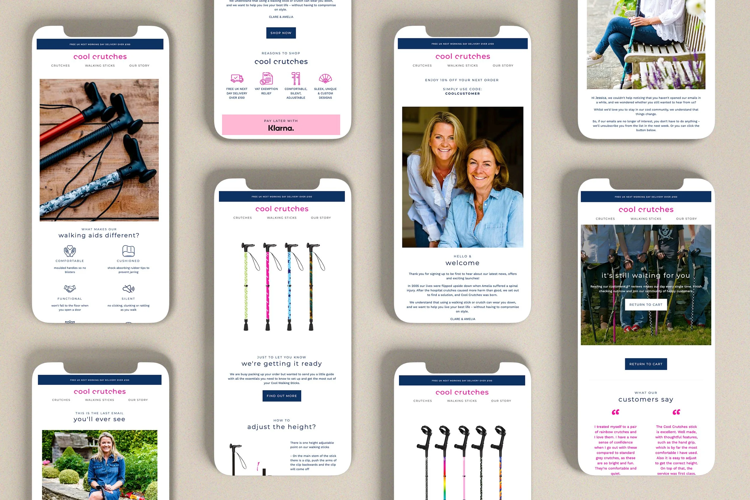
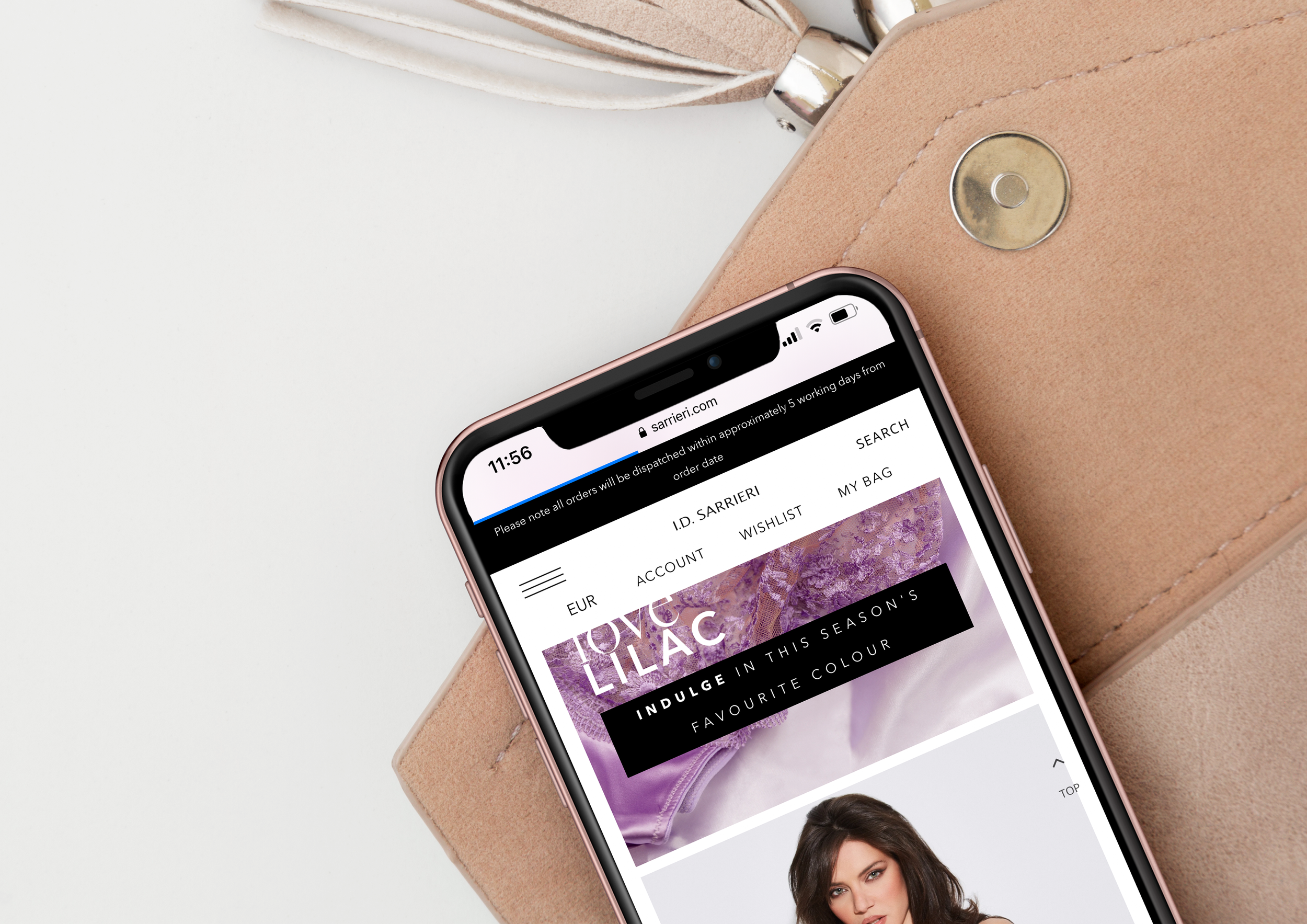
Begin your email with a hero image, the first visual that your audience comes across, that sets the theme of that email. This gives them a glimpse of what your email is about! Make it an image that will entice your audience in, grabbing their attention, wanting to scroll down to discover more.
PLACE YOUR CTA AS HIGH UP THE EMAIL AS POSSIBLE
CTA stands for call to action, a button or hyperlinked line of text that clicks through and directs you to a particular page on a brand’s website. This is normally placed after the hero image and heading, taking readers to the desired related page. CTAs generally use bright/bold colours and thoughtful placement, but the best ones use precise, actionable verbiage to attract attention. Examples include; ‘See the new looks’, ‘Start free trial’, ‘Register now’, or ‘Take 50% off’. The higher up on the email this is placed, the better. A nice simple way to improve conversions!


INCLUDE LIVE TEXT
By including live text in your email design, ensures that even if the images do not load, the email can still be read meaning the email isn’t completely lost. This also ensures anyone who is visually impaired and rely on reading tools to read emails will still be able to do so. If the text is only included in images, the reading tools will struggle to translate this!
Implementing these 3 important components to your email design will help to encourage your audience to delve further into your emails and could even help with converting traffic to sales! Give this a try or get in touch to find out how we can help with giving your emails a magic redesign!


